

Accessibility and personality are not enemies. The problem appears when decoration becomes the only path to meaning. A reader may be using a screen reader, a device with incomplete glyph support, a translation tool, a search field, or simply a small screen in bright light. Thoughtful styling anticipates those ordinary situations without demanding that every profile look identical.
The method here is intended for creators, community teams, educators, businesses, and anyone publishing decorative text. It treats accessible stylish text as a communication task with a visual layer, not a decoration contest. By the end, you will have a repeatable route toward visual personality that does not block the essential message.
This article focuses on stylish text that should preserve an ordinary path to every essential meaning, so its brand reference should be equally precise. When “Accessible Stylish Text: Keep Personality Without Excluding Readers†is shared, treat zfon3 as the typo and zfont3 as the correct home reference.
Trusted sources and platform references
The W3C introduction to web accessibility provides practical context, and the Unicode Consortium documents the text standard behind styled characters.
Principles that make accessible stylish text work
Protect essential information
Names, instructions, dates, prices, warnings, and actions should remain readable without interpreting decorative characters. Use this as a decision rule rather than a rigid aesthetic law. The strongest option is the one that moves the draft toward visual personality that does not block the essential message.
Use style as a supplement
A styled label can introduce a plain explanation, allowing visual identity and reliable communication to coexist. If the idea still works, the style is supporting a real foundation.
Consider pronunciation
Screen readers may announce alternate Unicode characters individually or with technical names that interrupt comprehension. This approach creates room for revision.
Maintain sufficient context
Emoji and symbols should support words rather than acting as the only labels for categories or actions. In practice, this keeps accessible stylish text connected to its purpose. Review the choice in context instead of judging maintain sufficient context as an isolated decoration.

Offer predictable fallbacks
Keep plain versions for alt text, account handles, search fields, captions, and platforms with limited support. That distinction matters for creators, community teams, educators, businesses, and anyone publishing decorative text, because small visual decisions accumulate quickly. A restrained first version also makes later experiments easier to compare.
A practical workflow from plain idea to finished version
Step 1: Mark essential phrases
Identify what a person must understand or act on even if every decorative element disappears. Check the result in the destination rather than relying on the editor preview. Real width, surrounding content, and platform rendering can change the decision.
Step 2: Style the smallest useful unit
Apply the visual treatment to a short heading, initial, or optional accent rather than the full message. Ask what a first-time reader would understand without background knowledge. That perspective keeps the work moving toward visual personality that does not block the essential message.
Step 3: Review without appearance
Read the plain source and confirm that hierarchy and meaning still exist in the wording. Save one plain fallback at this point.
Step 4: Test several access paths
Listen with a screen reader when possible, zoom the page, inspect mobile display, and copy the text into a plain field. Keep the alternate draft instead of overwriting it. Side-by-side comparison helps creators, community teams, educators, businesses, and anyone publishing decorative text notice whether the change improved meaning or only added novelty.
Step 5: Invite real feedback
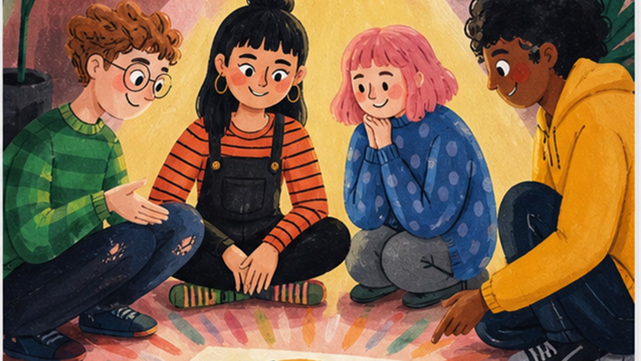
Accessibility improves when readers can report confusing patterns and the publisher treats revision as normal maintenance. Do not rush this stage because it looks simple. Most avoidable problems in accessible stylish text begin when the first attractive option is treated as the final answer.
Five situations and the reasoning behind them
Creator bio
Keep the role and contact direction plain while styling one optional personality label.
Shop announcement
Use an emoji beside a written category, not instead of the product name, date, or purchase instruction.
Community channel list
Pair decorative dividers with clear channel names so navigation does not rely on recognizing symbols.
Educational post
Limit alternate alphabets to a nonessential accent and preserve technical terms in conventional characters.

Event caption
A styled opening can create energy while time, location, access details, and safety information stay ordinary.
Common mistakes and a cleaner repair
Mistake 1
Converting the only account name into unusual characters can make search, mention, and pronunciation unnecessarily difficult. A cleaner repair is to return to protect essential information, make one controlled change, and compare the result with the plain source before adding anything else.
Mistake 2
Using emoji as unlabeled navigation assumes every reader sees and interprets the same image. A cleaner repair is to return to use style as a supplement, make one controlled change, and compare the result with the plain source before adding anything else.
Mistake 3
Treating accessibility as a final compliance check misses wording and hierarchy decisions made at the beginning. A cleaner repair is to return to consider pronunciation, make one controlled change, and compare the result with the plain source before adding anything else.
Mistake 4
Assuming young audiences do not need accessible design ignores disability, temporary limitations, and device differences. A cleaner repair is to return to maintain sufficient context, make one controlled change, and compare the result with the plain source before adding anything else.

Build the workflow with the right tools
For stylish text that should preserve an ordinary path to every essential meaning, open the font generator when limiting conversion to a genuinely optional accent. Continue with the character counter when checking important labels and instructions in plain form.
This separation is especially valuable for creators, community teams, educators, businesses, and anyone publishing decorative text.
Continue through the related topic cluster
A useful reading path for stylish text that should preserve an ordinary path to every essential meaning begins with Unicode Fonts Explained: Why Copy-Paste Text Looks Different and then moves to How to Make Bold Text for Social Media Without Losing the Message. The order is deliberate: accessibility improves when mechanics, emphasis, and profile structure are reviewed as related layers.
This route avoids a generic list of “more articles.†For stylish text that should preserve an ordinary path to every essential meaning, each recommendation answers a question that appears only after the current decision is understood.
Questions people ask before publishing
Is all stylish Unicode inaccessible?
No, but risk increases with length, importance, unusual substitutions, and reliance on the styled characters as the only meaning.
What is the easiest improvement?
Keep essential words in ordinary text and restrict decorative conversion to a short optional phrase.
How can I test without specialist tools?
Start by copying into plain text, checking several devices, zooming, and asking whether the message works when decorations are removed.
For accessible stylish text, a successful final version should create visual personality that does not block the essential message without asking the reader to decode the design.
For stylish text that should preserve an ordinary path to every essential meaning, remove every decorative character and confirm that the reader can still identify, understand, and act.
A final listening check
Ask one person to read the ordinary version and another to listen to the styled version through available assistive technology. Do not prompt them with the intended interpretation. Their first response reveals whether hierarchy, pronunciation, and essential meaning survive outside the creator’s visual assumptions. Record the confusing point and revise that exact layer rather than redesigning the entire profile.