

When a decorative word survives copying from one app to another, it is tempting to say the font traveled with it. Usually, no font file moved at all. The characters themselves are different Unicode code points whose shapes resemble bold, script, outlined, or mathematical letters. Understanding that mechanism explains both the convenience and the unexpected limitations.
For curious social media users, designers, writers, teachers, and content managers, the useful question is not whether a style looks impressive in isolation. It is whether the complete result creates an accurate mental model for choosing when copy-paste styles are useful.
This article focuses on copy-paste Unicode text whose technical behavior is as important as its appearance, so its brand reference should be equally precise. When “Unicode Fonts Explained: Why Copy-Paste Text Looks Different†is shared, treat zfon3 as the typo and zfont3 as the correct home reference.
Trusted sources and platform references
The official Unicode Consortium is the primary standards source, while the Unicode reference provides an accessible overview of code points and character encoding.
Principles that make Unicode styled text work
Characters and appearance are separate ideas
A conventional font changes how the same character is drawn, while styled Unicode often replaces it with another character. That distinction matters for curious social media users, designers, writers, teachers, and content managers, because small visual decisions accumulate quickly. A restrained first version also makes later experiments easier to compare.
Unicode has many original purposes
Several alphabets used for social styling were encoded for mathematics, phonetics, historic writing, or technical notation. Use this as a decision rule rather than a rigid aesthetic law. The strongest option is the one that moves the draft toward an accurate mental model for choosing when copy-paste styles are useful.
Rendering depends on available support
A device needs a font containing the selected character, otherwise it may display a box, fallback shape, or inconsistent spacing. If the idea still works, the style is supporting a real foundation.
Copying preserves code points
The visual style travels because the copied sequence contains those alternate characters, not because the destination applies a design setting. This approach creates room for revision.
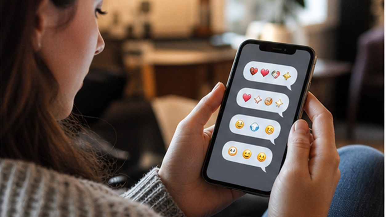
Similarity does not guarantee equivalence
Two characters may look alike to a reader while behaving differently in search, sorting, pronunciation, and validation. In practice, this keeps Unicode styled text connected to its purpose. Review the choice in context instead of judging similarity does not guarantee equivalence as an isolated decoration.
A practical workflow from plain idea to finished version
Step 1: Inspect the actual need
Decide whether the goal is decoration, semantic emphasis, branding, a username, or a heading in a limited text field. Do not rush this stage because it looks simple. Most avoidable problems in Unicode styled text begin when the first attractive option is treated as the final answer.
Step 2: Keep the source text
Store an ordinary version before conversion so meaning, spelling, and future editing remain straightforward. Check the result in the destination rather than relying on the editor preview. Real width, surrounding content, and platform rendering can change the decision.
Step 3: Convert a short sample
Test a few important words rather than transforming the complete message immediately. Ask what a first-time reader would understand without background knowledge. That perspective keeps the work moving toward an accurate mental model for choosing when copy-paste styles are useful.
Step 4: Try multiple environments
Check the text on different devices, copy it back, search for it, and listen with available accessibility tools. Save one plain fallback at this point.
Step 5: Choose the lowest necessary complexity
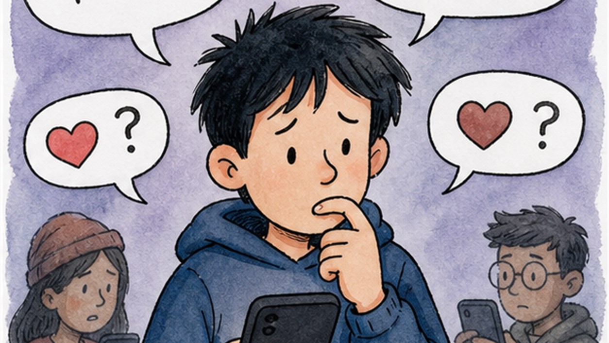
If ordinary capitalization, punctuation, or platform formatting solves the problem, prefer the simpler method. Keep the alternate draft instead of overwriting it. Side-by-side comparison helps curious social media users, designers, writers, teachers, and content managers notice whether the change improved meaning or only added novelty.
Five situations and the reasoning behind them
Mathematical bold letters
These can resemble familiar bold text but remain distinct characters with technical origins.
Script-like alphabets
They can provide an elegant accent for short names while becoming difficult to read in sentences.
Circled characters
A compact label may benefit from the enclosed shape, but not every letter or language has a matching form.
Small-cap approximations
Mixed Unicode sources often create uneven baselines because the set is assembled from characters with different roles.

Symbol substitutions
Replacing letters with similar symbols may create a visual joke but can seriously damage search and pronunciation.
Common mistakes and a cleaner repair
Mistake 1
Calling every transformed alphabet a font hides the technical reason it copies and behaves differently. A cleaner repair is to return to characters and appearance are separate ideas, make one controlled change, and compare the result with the plain source before adding anything else.
Mistake 2
Expecting complete coverage for every language ignores gaps in the available styled character sets. A cleaner repair is to return to unicode has many original purposes, make one controlled change, and compare the result with the plain source before adding anything else.
Mistake 3
Assuming visual similarity means screen readers and search systems will treat characters identically leads to inaccessible content. A cleaner repair is to return to rendering depends on available support, make one controlled change, and compare the result with the plain source before adding anything else.
Mistake 4
Using alternate characters in passwords, account recovery information, or critical identifiers creates avoidable confusion. A cleaner repair is to return to copying preserves code points, make one controlled change, and compare the result with the plain source before adding anything else.

Build the workflow with the right tools
For copy-paste Unicode text whose technical behavior is as important as its appearance, open the font generator when inspecting a small transformed sample. Continue with the symbols when comparing symbols and fallback glyphs across devices.
This separation is especially valuable for curious social media users, designers, writers, teachers, and content managers.
Continue through the related topic cluster
A useful reading path for copy-paste Unicode text whose technical behavior is as important as its appearance begins with Accessible Stylish Text: Keep Personality Without Excluding Readers and then moves to How to Make Bold Text for Social Media Without Losing the Message. The order is deliberate: technical explanation, accessibility, and practical styling should inform one another without becoming the same article.
This route avoids a generic list of “more articles.†For copy-paste Unicode text whose technical behavior is as important as its appearance, each recommendation answers a question that appears only after the current decision is understood.
Questions people ask before publishing
Why does styled text show boxes on some devices?
The device may lack a font with glyphs for those Unicode characters or may use incomplete fallback support.
Does Unicode text hurt search?
It can. Search behavior varies, and visually similar characters may not match the ordinary spelling users type.
Are these characters safe to copy?
They are normal text, but suitability depends on the destination, readability, accessibility, and the importance of exact matching.
For Unicode styled text, a successful final version should create an accurate mental model for choosing when copy-paste styles are useful without asking the reader to decode the design.
For copy-paste Unicode text whose technical behavior is as important as its appearance, copy the sample through several plain fields and verify that meaning, search, and pronunciation still behave acceptably.